My quest for a new programming typeface
I’ve been working all day everyday with Monaco for the last 6 years. Monaco is a great typeface, it has a number of really great properties. It has a large x-height, and a large m-width. This make it great typeface at small sizes. While monaco is a perfectly good typeface, I wanted experiment and see if there is another typeface that would be even better. I’ve always been a bit bothered that Monaco lacks both an italic and bold.
Over a week or so, I tried a number of commonly recommended fixed-width typefaces. I used each as my only typeface for at least an entire day. In the images below, Monaco is in blue, and the other typeface is in red. This allows easy comparison for sizing and appearance of a few glyphs.
Inconsolata
Inconsolata has a few really great glyphs. I really like the stacked ‘g’. It is fairly unique among mono-spaced fonts. Overall I found Inconsolata harder to read than Monaco, because of its much smaller x-height. If you don’t mind small typefaces that need anti-aliasing Inconsalta might be a good choice for you. Much like Monaco, there is no bold or italic for Inconsolata.
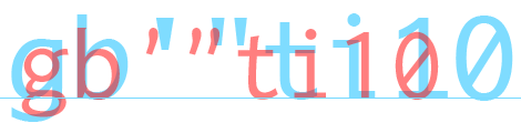
You can get Inconsolata here
Anonymous Pro
Anonymous Pro came highly recommended from a few of my co-workers and was the second font I tried. Anonymous Pro has a larger x-height than Inconsolata. I also found it to be really wide and thin, but that could have just been my eyes playing trickst on me. One problem I had was, I found the quote characters in Anonymous Pro to be very small and hard to read at my normal size. I ended up having to to pick a higher pt size to get a comfortable reading size. Due to its wider characters, this meant I could fit less text per screen than with other typefaces. On the upside Anonymous Pro has a bold and italic which are well designed.
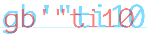
You can get anonymous pro here
Droid Sans Mono
Droid sans was released as part of the Android operating system. It combines many of the good features of Anonymous pro and Inconsolata. The x-height of Droid sans is almost the same as Monaco, and it has a stacked ‘g’ which I really like in a monospaced typeface. One bad aspect of Droid sans is the lack of slashed 0. This makes separating the 0 and O difficult. The free version of Droid Sans lacks a bold and italic, which was another problem for me.
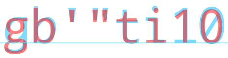
You can download Droid sans here
Bitstream Vera Sans Mono
Bitstream vera sans mono is released by the Deja Vu fonts project the project features a number of great free typefaces. Bitstream vera sans has a large x-height and looks reasonable with anti-aliasing off. It also features an italic and bold which are great.
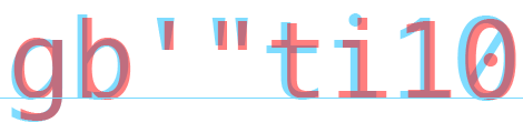
After trying out all of the above typefaces, I’ve settled on using Bitstream Vera Sans Mono for the time being. Having a bold and italic, is a welcome change, and provides a few more options for syntax highlighting. While Vera sans lacks some of the character found in Incoslata, or Anonymous pro, the larger x-height of Vera Sans helps keep text readable at smaller sizes.
I think you typo’d… It looks like Monaco is in blue, and other is in red, since blue is the same in each image.
Gordon on 12/11/11
I went through the same thing about a year ago after having not been able to find something I liked better than Monaco.
I ended up finding a variation of Apple’s Menlo font — Meslo S — and I quite like it. It might be worth taking a look.
Ryan Parman on 12/11/11
Yeah, I agree with Ryan; Menlo is a great typeface.
Thomas J Bradley on 12/11/11
Gordon: You’re right! I’ve fixed that now.
mark story on 12/11/11
Ryan: I’ll have to take a look and Menlo and Meslo S as well then :)
mark story on 12/11/11
I switch to vim (from TextMate) and so far the best font I’ve found that makes me feel really good is Inconsolata XL, mainly because it have a bold variant, so it feels really like Monaco in TextMate
anler on 12/12/11
Anonymous Pro is awesome… I keep going back to it..
Ryan on 12/13/11
I use Inconsolata and it’s great.
Jacky on 12/14/11
+1 for Comic Sans….no?
OK…
But for real, I will be downloading a few of these and giving it a shot. Thanks for the Monaco vs. whatever comparison. That’s definitely helpful!
Nate on 1/10/12
Hey Mark, i think that the spellin of the first title is wrong, IncoNsolata, not Incosolata.
bests ;)
edap on 2/26/12
I don’t do a lot of programming, but I do all my writing in LaTeX or Markdown with Sublime Text 2. After a similar search, I settled on FontFont’s Letter Gothic Mono, which has bold and italic variants (which I stubbornly insisted on using): https://www.fontfont.com/fonts/letter-gothic-mono
Daniel on 9/9/12
I have created two Monaco fonts with a different bold variants.
https://github.com/vjpr/monaco-bold
I could never find a font I was comfortable with using apart from Monaco.
Enjoy!
Vaughan on 6/8/13
just found this. i’m always looking, too, and have been using inconsolata-dz for years. It’s almost identical to the meslo ‘S’ font – and meslo wins by a hair (comparing them at 6-point is what finally convinced me!). See http://nodnod.net/2009/feb/12/adding-straight-single-and-double-quotes-inconsola/ for inconsolata-dz.
I’ll try Meslo S for a few days or weeks but I think it’s going to be my new font.
bill on 5/24/15