Creating folded ribbons edges with CSS
While working on tweaking a notification box design, I wanted to include the element’s heading in a folded ribbon element. I also wanted to avoid using any images and just use CSS. Mostly to try my hand at using generated content and some CSS that I don’t normally get to use.
The basic HTML for all the following example is:
- <div class="admonition">
- <div class="admonition-title">Note</div>
- <p>The content goes here</p>
- </div>
Creating the heading
First I needed to style the box and position the heading element:
- .admonition {
- position: relative;
- padding: 23px 10px 22px;
- margin: 20px;
- background: #fffdf2;
- border: 2px solid #ffcb00;
- font-family: Helvetica, Arial;
- }
- .admonition-title {
- position: absolute;
- top: -10px;
- left: -10px;
- padding: 4px 8px;
- background: #df9c00;
- color: #fff;
- }
This creates elements that look like:
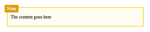
The container box needs to have relative positioning as all the heading and fold element will need to be positioned.
Adding the fold and other effects
Now I need to add the folded element that sits ‘behind’ the heading. Since the fold will be a triangle, I can use border tricks to create a triangle and apply that to an :after pseudo element. I’ll also add some shadows for additional depth:
- .admonition {
- position: relative;
- padding: 23px 10px 22px;
- margin: 20px;
- background: #fffdf2;
- border: 2px solid #ffcb00;
- font-family: Helvetica, Arial;
- }
- .admonition-title {
- position: absolute;
- top: -10px;
- left: -10px;
- padding: 4px 8px;
- background: #df9c00;
- color: #fff;
- -webkit-box-shadow: 1px 1px 2px rgba(0,0,0,0.3);
- -moz-box-shadow: 1px 1px 2px rgba(0,0,0,0.3);
- box-shadow: 1px 1px 2px rgba(0,0,0,0.3);
- }
- .admonition-title:after {
- content: '';
- display: block;
- height: 20px;
- width: 8px;
- position: absolute;
- top: 24px;
- left: 0px;
- background: transparent;
- z-index: -1;
- border-top: 45px solid #eed993;
- border-left: 45px solid transparent;
- }
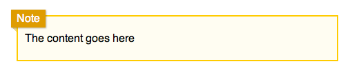
This creates the illusion of a folded sheet behind the heading. Its also interesting that you can create any any triangular shape by combining solid and transparent borders. A really nice benefit of this effect is it degrades well in older browsers. Browsers that don’t support box-shadow or pseudo elements get a slightly less sexy result, but they can still access and use the content.
I’ve put an example up on jsfiddle . I’m sure I’m not the first person to figure this out, but I thought it was an interesting way to create an effect with CSS, that previously would have required images.
Nice little trick, Mark. I’m going to put it to use on a site I’m working on.
A side note: if you use
border-left: 45px outset transparent;instead of ‘solid’, it will get rid of that pesky faint dotted line that Firefox adds.
Jeremy on 8/29/11
keep doing this ,i am gonna use your trick
dex on 8/30/11
Very short code. Surprised.
Victor on 9/10/11
awesome stuff, man.
Hugo on 12/19/11
this doesn’t seem to work when placed inside of a div that has a background color applied. (body color is dark, and page-wrap is white)
Any idea why?
barbara on 1/3/12