Re-designing CakePHP
Myself and the rest of the CakePHP team recently embarked on a journey to refresh and redesign the CakePHP website and brand. I wanted to delve into my process and thinking around the changes.
The cakephp.org website has been around for quite sometime. Its previous incarnation served the project amazingly well. It basically created the branding and design aesthetic most people associate with CakePHP, and was featured on a number of design galleries and featured sites lists. When starting the redesign, there were a few things the team felt passionate about keeping.
- Logo – There was nothing broken with the logo. It is well recognized and should stay mostly un-touched.
- Retro feel – CakePHP gained a reasonable amount of attention from its retro design. It has been featured in a number of design collections. The retro feel was something most of the team was passionate about keeping. To me, the retro feel distinguishes CakePHP from almost every other framework, and was important to keep.
- Halftone patterns – You could say this was part of the retro feel, but I felt it was important enough to mention separately. Halftone patterns are used pretty much everywhere in the CakePHP design language. I personally love them, and wanted to keep them.
With the list of things we loved done, I made a list of things I didn’t like and thought hadn’t aged well after 4 years:
- The design used too many colours. At last count there were 5 beiges and 4 blues. This was simply too many colors to make a simple consistent design.
- Small text sizes. I find small text hard to read, and as more people shift to using mobile devices tiny text can be even harder to read.
- Inconsistent across sites. The design was inconsistently implemented across the various properties CakePHP has. Implementing a new design will obviously magnify that. However, for the 3 sites using the new design, I feel its been implemented more consistently than before.
- No mobile affordances. The old sites relied on page zooming for mobile devices. I wanted the new design to work well on mobile and tablet devices.
- The site didn’t really do a great job of telling people why they should use CakePHP.
- There wasn’t really a good place for news about the project, other than the over-used ‘extra-hot’ banner. Having a way to re-publish important Bakery articles would be ideal.
My design process and tools
My design process is pretty simple. I generally start in pencil, and scribble out some ideas. Once I’m happy with that level of detail, I move on to wireframes in Balsamiq . I find Balsamiq is great for giving a fast low-fi way to share designs. I use them to refine the concepts and general layout of a design, and show them to the rest of the team. Once, myself and the rest of the team are happy with the wireframes, I move onto Illustrator. Yes, I’m one of those weird people that uses Illustrator for web-design. Unlike most people however, I like that it is a bit wrong, and not-pixel perfect. This stops me from getting too precious with the design before I convert it into HTML. I’m forced to limit the detail in the illustrator mockups, as the tool just isn’t that good. I also find the text tools in Illustrator far better than those in Photoshop. At the Illustrator stage, I try to focus on general colour design, vertical and horizontal rhythm, typefaces and patterns. I don’t worry about getting things pixel perfect as its a waste of time. You have to get everything pixel perfect twice then. Once in Photoshop/Illustrator and then again in CSS.
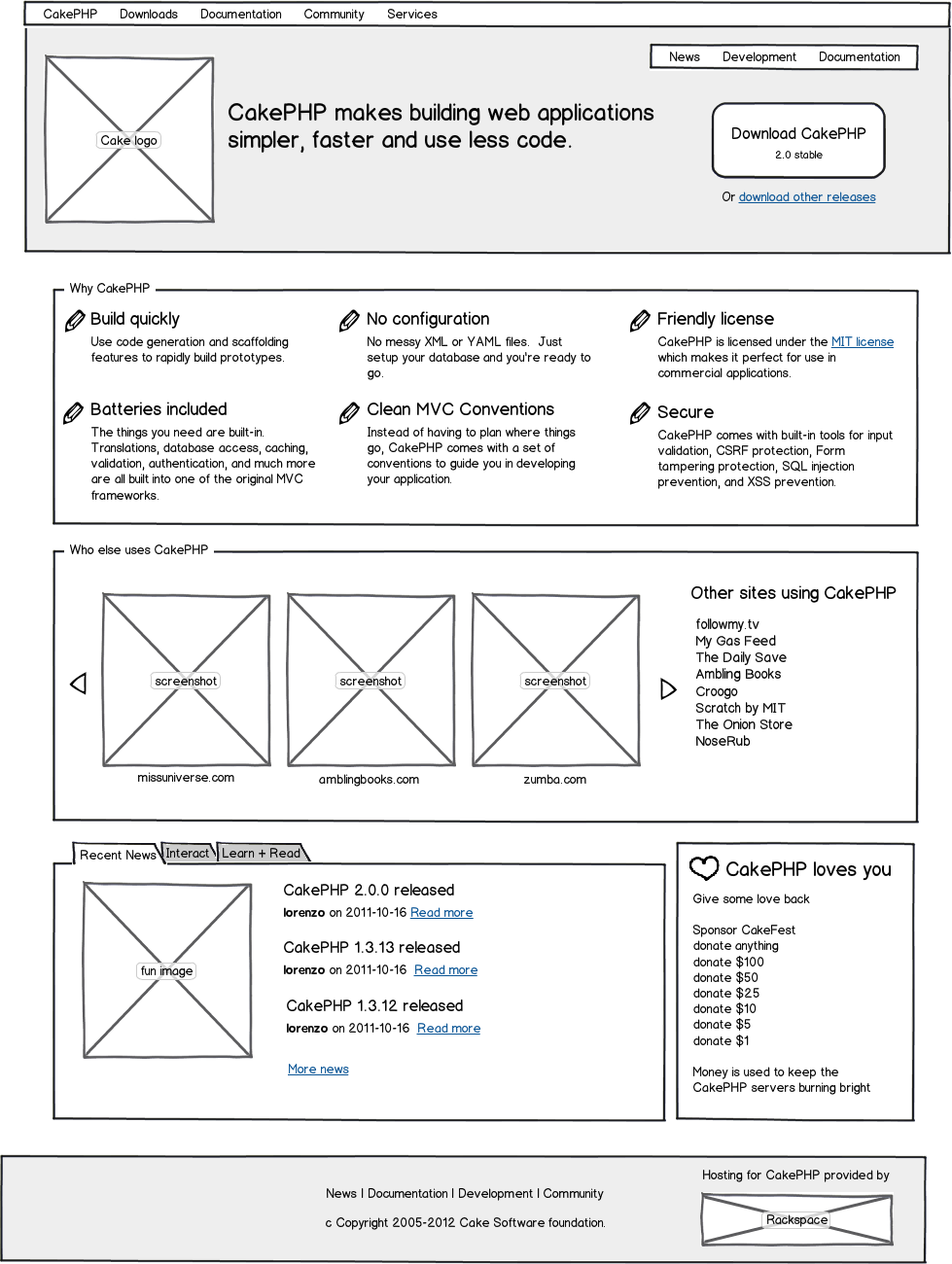
With the lists of good and bad done, here are some results of the process described above. Starting with the wireframe
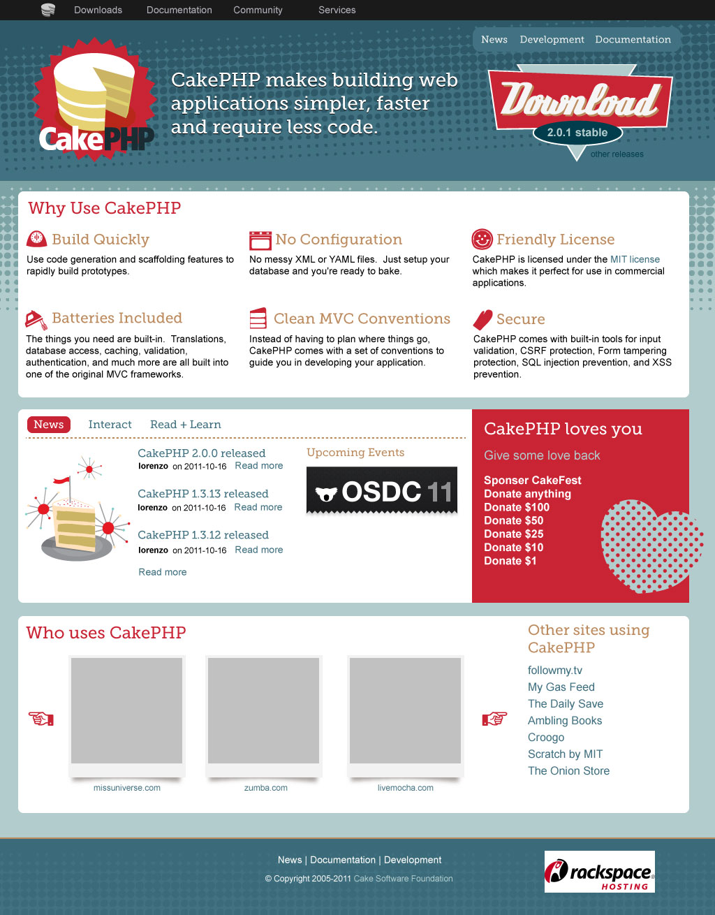
Next up is the initial Illustrator mock-up. The design is largely the same, but has a complete palette and icons. I got the colour palette from a great book called The designer’s guide to color combinations Its a fantastic catalog of historic colour palettes and features a great selection of great retro palettes. The icons and illustrations were done by my very talented wife . She’s available for client work as well if you’re interested. The last draft of the illustrator designs looked like this . As you can tell, this is not the same as the final design, and the last few iterations of the design were done in HTML + CSS. I find tweaking designs easier and faster in HTML than in Illustrator.
Implementation and responsive design
The site is implemented with CakePHP of course. Its a primarily static site, with dynamic content via a git repository inspector, and RSS consumer both build by Graham Weldon . I used AssetCompress to combine assets. One of the most interesting parts for me, was using zurb foundation for the layout grid and responsive design elements. Zurb foundation was also used for the book.cakephp.org redesign. I chose foundation, for a few reasons. It provides very low-level features, without a ton of flash, or design opinion. This means there is less to rip out later, when t didn’t fit the site aesthetic. Foundation features great documentation, and readable code. I didn’t look at many other systems, as I’ve been following foundation for a while, and really like how they’ve solved the problem I had.
Conclusion & Lessons learned
I’m really happy with the re-design. I think we ended up at a simpler, cleaner website/brand for CakePHP. The feedback so far has been amazingly positive, and the concepts underlying the design have shown to translate well across several of the CakePHP properties with more underway now.
Along the process I learned a few lessons about building responsive designs. You should plan to spend a considerable amount of time planning the various resolutions/sizes. While using a grid can help, you still have work to do. Elements like larger images either need to be scaled or swapped out at small sizes. For example, the download button has 3 variations so it fits on all 3 device sizes. I also found that positioning need to to be tuned at the various sizes. I also found that menu bars can be tricky. I ended up converting the menu used in CakePHP to a select box. I found this to work better than other sliding box style navigation, as most mobile devices have great support for select boxes.
hi,
website rss does not work!
please check this.
best regards
Reza on 4/7/12
Reza: Whoops, I must have broken it with a recent update. It should be working now.
mark story on 4/10/12
Hi Mark! Excellent Design. I visited the cakephp.org site on my phone and it looked great! Could you please give us a tutorial on how you did that so that we could mobilize our web apps using cakephp. Thanks man!
David Umoh on 4/13/12
David: Most of the hard work is handled by zurb foundation. It does all the layout re-flows on resize, and for different formats. The hardest and most tedious part is making sure everything fits + flows at the various sizes and making any decisions to hide/show content at different sizes.
mark story on 4/17/12
Really informative writeup, loads of links to sites I need to checkout further.
Awesome.
Martz on 4/19/12
It is amazing how the new design makes me want to come back to the site more often.
XuDing on 4/20/12
It is amazing how the new design makes me want to come back to the site more often.
XuDing on 4/20/12
New Design. New Version. Power :)
anh vien ao cuoi on 5/27/12
So, if I wanted to start using CakePHP, is it responsive? Do I combine CakePHP with Foundation? Is there a god? What’s the meaning of life? I need an answer to at least the first two questions, thanks. :)
Justin on 7/25/12
So, if I wanted to start using CakePHP, is it responsive? Do I combine CakePHP with Foundation? Is there a god? What’s the meaning of life? I need an answer to at least the first two questions, thanks. :)
Justin on 7/25/12
Sorry, I really like to post my comments twice for no reason.. :/
Justin on 7/25/12
Justin: The built-in layouts in CakePHP don’t feature any responsive design features. However, its not hard at all to combine CakePHP + Foundation together.
mark story on 7/26/12
Hi,
The global design is really nice and clean ! :)
For the section of the documentation some people did not find the possible languages. May I suggest to put the languages to choose at the top of the page, next to the choice of the book’s version.
I think it would be much readable.
cake17 on 10/22/12
cake17: We run out of room at the top of the page pretty quickly on smaller screens which is one reason its at the bottom now. But there is probably a more easy to use design that still works on small screens.
mark story on 10/30/12
Hello Mark,
Excellent article on your thought process for the redesign. I am now getting into CakePhp and am very interested in responsive design for an application I am building. Are you still using the Zurb Foundation for CakePhp.org. Any pointer for information on using Zurb and CakePhp for mobile friendly apps? I really like that mockup app too.
Thanks.
Andre on 3/18/13
Andre: CakePHP.org and pretty much all the other re-freshed CakePHP domains are all using Foundation2. I’ve not had the time to upgrade to the latest version. My best tip for doing mobile friendly sites is to do a ton of testing with different screensizes, and figure out what content should be visible & at what size for each screen resolution.
mark story on 3/23/13
tks your share!!!
bang dinh on 2/27/14