Building a confirm dialog flow with htmx
When re-building docket with htmx, I wanted to retain the confirm dialog experience I had with react. Instead of taking on a dependency for this, I chose to build my own combining HTMX and Webcomponents. The resulting UX feels snappy and similar to a client rendered experience. My end result looks like this:
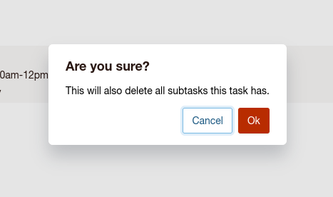
These kinds of dialogs get used all the time for confirming destructive actions – like my task delete confirmation above.
HTML and CSS
Starting off with the HTML and CSS, we have a basic container that is our webcomponent:
- <modal-window open="true">
- <?= $this->fetch('content') ?>
- </modal-window>
This is a ‘layout’ file from my PHP templates. $this->fetch() reads a block of content from the template that is rendered into the layout. Inside my layout, I place the HTML for the contents of the dialog including the dialog element.
- // Render into the modal layout
- $this->setLayout('modal');
- // Set resource specific content
- $target = ['_name' => 'tasks:delete', 'id' => $task->id];
- $title = 'Are you sure?';
- $description = 'This will also delete all subtasks this task has.';
- // HTML and PHP template
- <dialog class="confirm-dialog" data-testid="confirm-dialog">
- <?= $this->Form->create(null, ['url' => $target]) ?>
- <h2><?= $title ?></h2>
- <p><?= $description ?></p>
- <div class="button-bar-right">
- 'modal-close' => '1',
- 'class' => 'button button-muted',
- 'data-testid' => 'confirm-cancel',
- 'tabindex' => 0,
- ]) ?>
- <?= $this->Form->button('Ok', [
- 'type' => 'submit',
- 'class' => 'button button-danger',
- 'data-testid' => 'confirm-proceed',
- ]) ?>
- </div>
- </dialog>
This template is rendered by a controller action that does a record load, authorization check that looks like.
- // TasksController
- public function deleteConfirm(string $id): void
- {
- $task = $this->Tasks->get($id, contain: ['Projects']);
- $this->Authorization->authorize($task, 'delete');
- // Set values to the template context
- $this->set('task', $task);
- }
This method is exposed at the URL /tasks/1/deleteconfirm. I’ve authored the CSS with sass. There are a few mixins for common button styles and some sass variables that reduce magic numbers:
- .modal-float {
- outline: none;
- position: absolute;
- top: 5vh;
- left: 5vh;
- right: 5vh;
- bottom: 0;
- border: none;
- padding: 45px 20px 20px 20px;
- background: var(--color-bg);
- border-radius: $border-radius-large $border-radius-large 0 0;
- box-shadow: var(--shadow-high);
- }
- .modal-title {
- display: flex;
- justify-content: space-between;
- align-items: center;
- margin-bottom: calc($space * 3);
- h1, h2, h3, h4 {
- margin: 0;
- }
- }
- .modal-close {
- @extend .button-bare;
- display: flex;
- justify-content: center;
- position: relative;
- top: -2px;
- right: -5px;
- border: none;
- border-radius: 50%;
- font-size: $font-size-large;
- line-height: $font-size-large;
- height: 30px;
- width: 30px;
- padding: 5px;
- margin: 0;
- box-shadow: none;
- }
- .modal-contents {
- height: 100%;
- overflow: auto;
- }
- @media (max-width: $breakpoint-phone) {
- .modal-float {
- top: $space * 2;
- left: 5px;
- right: 5px;
- padding: 45px $space $space $space;
- }
- }
- .modal-float {
- top: 5vh;
- left: 5vh;
- right: 5vh;
- bottom: auto;
- border-radius: $border-radius-large;
- padding: 20px 20px 20px 20px;
- }
- @media (max-width: $breakpoint-phone) {
- .modal-float {
- top: 1vh;
- left: 1vh;
- right: 1vh;
- }
- }
I also use CSS custom properties to enable dark mode, and theming. For layout and spacing I use sass variables.
The ModalWindow component
Back in our HTML, we used a custom component modal-window. We now need to define the behavior of that component. I’ve chosen to use the basic webcomponent APIs as I wanted to learn the ‘hard way’ to better understand how the basic APIs worked. I’m still early in my webcomponents learning, and I want to understand the pain points of the browser APIs before learning the abstractions. This is the current state of my homebrew ModalWindow component. It has some rough corners with regards to usability, but as a solo recreational project it fits my needs well enough.
- // Define a subclass of HTMLElement
- class ModalWindow extends HTMLElement {
- // This is effectively onMount callback.
- connectedCallback() {
- const open = this.getAttribute('open');
- const dialog = this.querySelector('dialog');
- if (open && dialog) {
- dialog.showModal();
- }
- this.setupClose(dialog);
- this.closeOnSubmit(dialog);
- }
- // You can easily query your subtree to attach behavior based on custom attributes.
- setupClose(dialog: HTMLDialogElement | null): void {
- const closer = this.querySelector('[modal-close="true"]');
- if (!closer) {
- return;
- }
- closer.addEventListener(
- 'click',
- evt => {
- evt.preventDefault();
- if (dialog) {
- dialog.close();
- dialog.remove();
- }
- },
- false
- );
- }
- // Because we want all modal windows to have a distinct URL we can use
- // back() for cancel and submit forms to take actions.
- closeOnSubmit(dialog: HTMLDialogElement | null): void {
- const form = this.querySelector('form');
- if (!form || !dialog) {
- return;
- }
- dialog.addEventListener('submit', () => dialog.close(), false);
- }
- }
- // Attach our HTMLElement to the DOM.
- customElements.define('modal-window', ModalWindow);
- // Export for testing or re-use elsewhere.
- export default ModalWindow;
I appreciate how well the browser native APIs for querying and manipulating the DOM work these days. Being able to write simple Javascript components without libraries is lovely. I do however, like using typescript. I find it useful when learning new browser APIs via the methods and properties summaries. I also appreciate typescript’s ability to detect entire classes of problems.
This is a fairly simple component, because the recently added dialog element is doing a lot of the lifting for us. dialog is a fairly new component that is part of the work being done to add more foundational UX patterns in the DOM. It is handling showing the ‘backdrop’ and capturing clicks. Within the DOM dialog’s also expose methods to hide and show the dialog.
Connecting the interaction
We can now have pages that contain links to start a destructive action. This is a GET request that returns a form within a modal-window. If the user confirms the delete, they submit the form in a POST request. With the confirmation complete, we redirect the client back to their referrer or a collection view. When we fetch the confirm view, we’re going to use htmx to splice the response into the DOM. We’ll start by fetching our confirmation modal with a link
- <a href="<?= $this->Url->build($deleteConfirmUrl) ?>"
- hx-get="<?= $this->Url->build($deleteConfirmUrl) ?>"
- hx-target="body"
- hx-swap="beforeend"
- >
- Delete Task
- </a>
We’ve attached htmx to this link. Instead of directing the entire viewport to this URL, htmx will fetch content from the provided URL in the background and can insert it that content into the DOM anywhere you’d like. Here, I’ve just appended the modal window to the bottom of the DOM. When the HTML from our response is inserted into the DOM, our webcomponent will trigger connectedCallback and show the dialog.
I am pretty happy with the UX this provides. It has lots of opportunity for improvement and I plan to tinker on it for a while longer. Hopefully it can show how much UX you can build with webcomponents and a small amount of htmx on top. Not every application needs the power of react or vue, and those scenarios can be a great fit for htmx to improve the interactions in your application with server rendered HTML.
Just saw your presentation from Cakefest on YouTube this week, I had never really heard of htmx before but had been looking at libraries like Inertia.js (via the cakephp-inertia plugin) to do something similar. Htmx looks like a lightweight alternative.
Thanks for all your work, hopefully next year I can make it out to the conference in person.
Zoltan on 7/31/24
I really like how you’re fetching the entire modal layout and appending it to the body. So many of the modal examples I see on the web (for HTMX) involve trying to target a modal container (typically Bootstrap) that is already on the page. I much prefer your approach – it makes it feel more like a normal page navigation mechanic and not some specialized swap.
Ben Nadel on 4/28/25